
“There were 703 million persons aged 65 years or over in the world in 2019. The number of older persons is projected to double to 1.5 billion in 2050. Globally, the share of the population aged 65 years or over increased from 6 per cent in 1990 to 9 per cent in 2019. That proportion is projected to rise further to 16 per cent by 2050, so that one in six people in the world will be aged 65 years or over.”

This is one of the first paragraphs of the report of the Department of Economic and Social Affairs of the United Nations: “World Population Ageing 2019”. In Europe, the over-65s already represent 19.2% of the population. Of these, 45% use the internet at least once a week and 73% own a smartphone (Eurostat data).
Unfortunately, a large part of the elderly population lives with age-related deterioration of health (Alzheimer’s, dementia, degenerative diseases…). This is in addition to the difficulties arising from the normal and progressive deterioration of physical and cognitive abilities, which together make independent living difficult for older people. However, most of them live alone or with their partner and it becomes necessary for them to be autonomous and active in the digital world.
This begs the question of how the elderly manage to adapt to virtual communication, but even more so whether and how this age group is taken into account in the design of such devices.
It is time for all of us to think about the user experience from a different perspective. We need to stop thinking that our users only navigate through a smartphone, as millennials and the z-generation do. We need to start thinking about the needs of the elderly population as well. After all, designing a website accessible to the over-65s allows us to include quite a large number of potential users in the future… and even already in the present. It is no secret that people over 65 generally have the highest household wealth figures of any age group.
So how can we design a UX that is also accessible to the elderly?
First of all, let’s clarify what are the many problems that older people encounter when approaching the digital world:
- mouse control is becoming increasingly difficult. Most people over 75 are not fluent in mouse movements;
- do not respond readily to visual design stimuli;
- they may need magnifying glasses or screen readers;
- conventions that are commonly used of user interface symbols may be unfamiliar;
- attention is limited as well as the ability to learn.
This does not mean that all older users automatically have all the problems listed above. A boomer in their seventies may well have no problem navigating Netflix, while others may never have heard the term ‘streaming’. But it is true that one in six people over the age of 70 has, for example, some form of visual impairment. And visual impairment is by far the most common disability reported in older people. So it makes sense to think about usability in different age groups within the broader concept of usability.
1. Readable typography
The first thing to take into account is the visual impairment of boomers and seniors, so it is vital to design web pages and applications with clear and legible typography. The two parameters to be taken into account are contrast and font size; the higher the contrast, the simpler and larger the fonts used (minimum 12 pt and not italic), the easier they are to navigate.
Below you will find some examples of websites with clear and legible typography. I have purposely chosen beautiful, interactive and engaging examples because we need to dispel the myth that accessibility is synonymous with something boring and sad. Yes, there are accessible sites that are boring and visually unattractive, but there are just as many inaccessible sites that are equally sad.
2. Clear instructions
The over-65 generation is a generation of people who read a lot and rely a lot on what they read. They read newspaper articles or blog posts to the end and read all the instructions if any. Let’s make sure there are clear instructions to follow. A good example is to offer a ‘start here’ page in the navigation, an unambiguous starting point.
3. Defined focus points
One difficulty that older people have to deal with is the deterioration of their motor skills. Specifically, pointing the mouse is often not smooth and is interspersed with irregular and discontinuous movements. We design large buttons that have sufficient safe space around them, that are not too close together and that do not require double-clicking.
4. Fluid navigation
Due to declining cognitive abilities, elderly people need particularly clear navigation, especially if we think about the fact that a website or an application hardly ever has a single navigation flow and instead has numerous entry points. It is useful to:
- provide the map site;
- provide a content search function;
- provide a descriptive page title so that it is easier to understand the search results;
- always make the breadcrumb of the page visible;
- provide an easily visible link to the homepage;
- indicate the current position within the site;
5. No scrolling
The scrollbar can also be a problem either because of degraded motor activity or because elderly people are simply not used to using it. Because of this, the best thing is definitely to make sure that essential information is “above the fold” and to design a visually simple and intuitive scrollbar.
6. No memory need
Cognitive degeneration is another key aspect that results in a lack of memory. Remember to design for users who cannot keep too much information in mind. Carousels that display images and text too quickly are useless and dangerous, as are security codes sent by email that force you to remember strings of numbers that change every time or increasingly complicated website passwords.

7. No concentration need
Another aspect of cognitive degeneration is the lack of concentration whereby users process information more slowly, are easily distracted when performing long tasks, and are easily lost if there is a need to solve a problem.
Some design solutions are:
- slower carousels with less information in each slide;
- possibility to pause and restart multimedia contents;
- page refresh not automatically, but with a system that requires user confirmation;
- the sound that turns off automatically in 3 seconds;
- provide a warning to the user when the time of a session is about to end.
8. Plain language
Many of them find it particularly difficult to understand complex sentences, uncommon words, technical jargon or slang. So it makes sense to provide:
- information divided into smaller sections and ‘nestled’ in lots of white space;
- descriptive titles;
- labels accompanying icons;
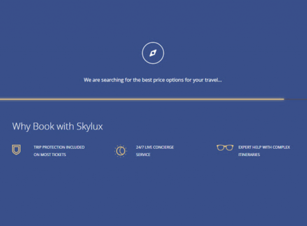
- clear language, without slang and technicalities. If, for example, I am on a financial app that is loading data and the loading page just says “Hang on” or simply presents a spinner, we are using slang and technicalities of the IT world. We take it for granted that everyone knows that behind a loading page there is a loading of data from the server, but this is not the case. We could avoid cognitive effort by writing “Your data is loading”.
9. Step by step form
Finally, when an older person makes a mistake or an error during their experience on a website, they tend to be frightened by it. Unlike young people for whom learning the functions of an app or website is done by trial and error, an older person is very intimidated by the mistake, by not being able to fix it, and is scared if the interactions they have to make are unsafe.
It makes sense to provide:
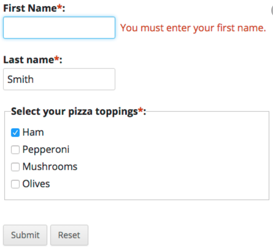
- textual instructions at the beginning of the form or just before each input field
- grouping of similar elements
- the possibility to review and correct answers
- provide suggestions for error correction after each input and not at the end of the form.
There is still a market out there for older people who want the opportunity to be active in the digital world. While these users are often ignored or misunderstood, this is the right place to start when it comes to implementing a more inclusive design. Remember, however, that the way to make sure we design the right solution for each of our users is to test. User testing gives us the unique information we need to determine if our UX for over 65 really works.