Variable fonts
June 17, 2019
Elena Venieri


A font revolution for the digital world This was one of the main subjects of the fourth edition of the CssDay in Faenza. The panorama provided by Giulia Laco highlighted current digital printing technologies and mentioned the future scenarios with the gradual introduction of “variable fonts”, the real engine driving this change. In actual fact, the arrival of variable fonts was announced by the four giants of the digital era — Microsoft, Google, Apple and Adobe — in September 2016, during the ATypl conference in Warsaw, so it can be defined as the first great revolution after the introduction of the OpenTypes in 1994.
“While earlier font interpolation technologies emerged from the font format wars of the early 1990s, and were developed and championed by individual, competing software companies, OpenType variable fonts are the product of a new collegiality aimed not only at defining a common standard but also interoperable implementations.” John Hudson
What OpenType is and how we use it today
The technology that we currently use for digital printing originates from Adobe and Microsoft, who introduced OpenType in 1994. There are many advantages of OpenType with respect to the already existing TrueType and Postscript. OpenType is cross-platform, can host more than 65,000 glyphs per font and adopts the Unicode standard, hence each glyph corresponds to an international unique code. But above all, OpenType gave birth to the font super families. Now we can choose from Monteserrat Thin, Extra-Light, Light, Regular, Medium, Semi-bold, Bold, Extra-bold, Black and the related italic ones, without being limited to just Bold and Italic.
Variable Fonts
The definition of variable fonts, the official term for which is “OpenType Font Variations”, is provided by John Hudson in a tweet:
“A single font that behaves like multiple fonts”
The single font that behaves like multiple fonts comes from the possibility to fluidly modulate an almost infinite number of variables, called axes. There are over 64,000 possible axes and it is the type designer who decides which axes to make available for the individual font. The changes on each axis take place fluidly. For example, on the weight axis you can choose any intermediate value between the masters pre-fixed by the type designer. In actual fact, even the presence of the masters — the extremes — of each axis is at the discretion of the font designer, so we could have an infinite number of values for each axis.
The axes can affect any style variable: weight, presence and type of serif, horizontal and vertical proportion, font inclination, etc.
Below is an interesting illustration by John Hudson that shows how the axes work, in particular the behaviour of a font with 3 axes. The red glyph at the centre indicates the default profiles set by the type designer, the green glyphs are the extremes of the 3 axes and the orange glyphs are the angle positions. The illustration obviously represents a cube because we are working with 3 axes, but it could be a rectangle if we were working with 2 axes, a line if there were only one axis or a hyperspace with various dimensions if there were > 3 axes. This is also a standardized illustration as the distance between the extremes and the default position is the same.
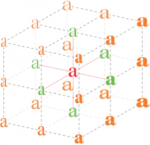
In this way the quantity of variables for each available font can be perceived, but with the following example we can understand the real extent of the effective possibilities of variable fonts.
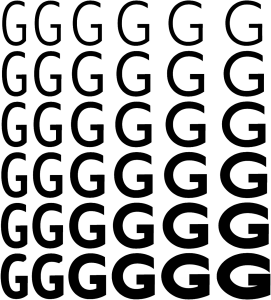
The illustration below shows a font with two axes: weight and width. With 6 variations for each axis, we have created 36 different fonts, within a single file. However, the number of variations for every single axis could theoretically reach 1000, and by constructing a 1000×1000 matrix, a million variations. If we introduce a third axis we reach a billion possible variations.
Below are 3 examples provided by Adobe for supporting variable fonts in Photoshop.
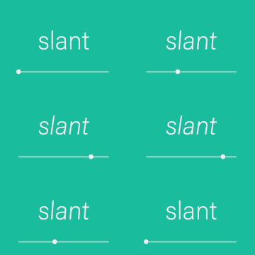
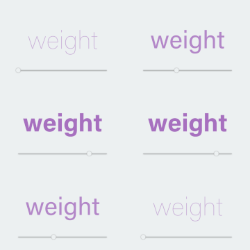

From this is it easy to see how variable fonts can handle virtually all aspects of font design.

How they are integrated
First of all, the designated font needs to be inserted into the page like any other web font. For example, the @font-face rules can be used.
@font-face {
 font-family: "Avenir Next Variable";
 src: url("AvenirNext_Variable.ttf") format("truetype");
 }
Different variable fonts can be found on Axis Praxis, but Adobe is also transforming its most famous fonts into variable fonts.
So, it is important to define it with the font-variation-settings rule.
body {
 font-family: "Avenir Next Variable";
 color: rgb(0, 0, 0);
 font-size: 148px;
 font-variation-settings: 'wght' 631.164, 'wdth' 88.6799;
 }
For the axes, any value between the minimum and the maximum set by the type designer can be used, but it is fundamental to specify a value for all the axes of the font.
Therefore, if our font can have 15 axes, we need to declare all of them.
div {
 font-family: Decovar;
 font-variation-settings: 'INLN' 285.094, 'TSHR' 346.594,
 'TRSB' 786.377, 'SSTR' 84.268, 'TWRM' 200, 'SINL' 84.268,
 'TOIL' 0, 'TINL' 91.983, 'WORM' 0, 'wght' 400, 'TFLR' 0,
 'TRND' 0, 'SWRM' 0, 'TSLB' 277.155, 'TBIF' 0;
 }
What are the advantages?
1. Saving space
The fundamental advantage of OpenType 1.8 is the enormous saving of physical space, both on disc and online. If we want to load 12 variants of Roboto right now, we have to load 12 files. With variable fonts we only need to load a single file for an infinite number of variants.

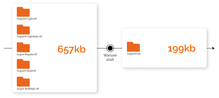
Here is the example explained by Microsoft to theWarsaw 2016 conference. If we load the current Segoe UI font, with 5 variants from Light to Bold, we occupy 657 kb. The OpenType 1.8 version of Segoe UI only occupies 199 kb, with the resulting difference in online loading between the two versions which is enormous in performance terms.
2. More options and variants
The second clearly visible advantage is the quantity of options and variants available to creatives and graphic designers. So different alphabets, symbols and glyphs can be handled in an optimal way.
3. Responsive typography
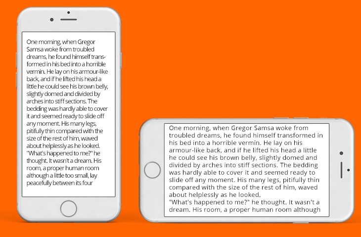
Finally, OpenType 1.8 creates a font that can behave differently according to the physical variables in which it is used, e.g. whether we use it on a larger or smaller screen, in landscape or portrait version. We could think about making the contents more legible by using a variant with a larger weight on small screens, which becomes lighter as the screen or the zoom increases. Or we could use the width axis of the font to use a condensed variant if the screen is in the portrait version and a regular variant if the screen is in the landscape version. Hence, we are approaching a fluid movement of the font that leads towards responsive typography.
And in the near future? Integration
Variable fonts are still considered a new feature and as such require a number of steps before becoming fully integrated.
Graphic design software, with the latest Photoshop and Illustrator updates in October 2017, already fully supports variable fonts.
But their integration with the browsers is still a work in progress. However, whereas in November 2017 only 7% of browsers supported variable fonts, in January the percentage had already risen to over 60%. This means that variable fonts are a technology that can already be used.

Finally, the current rather limited availability of fonts for commercial use must be considered. But numerous licence-free examples can already be found, on Axis Praxis.
Conclusion
The transition from the web fonts that we now know to variable fonts will be like passing from a JPEG to vectorial SVG. They will probably co-exist for a long time, but the advantage of variable fonts will become increasingly clear. We are already thinking about applying this approach to our next projects, especially in the mobile area.
Original article posted on Antreem blog