Rekeep
Where the effective and trouble-free work of employees is the priority. Usability, flows and design system are mixed together for a great result.
Year
2019
Industry
Facilities
Role
UX & UI designer
Team
Team by Antreem
The goal
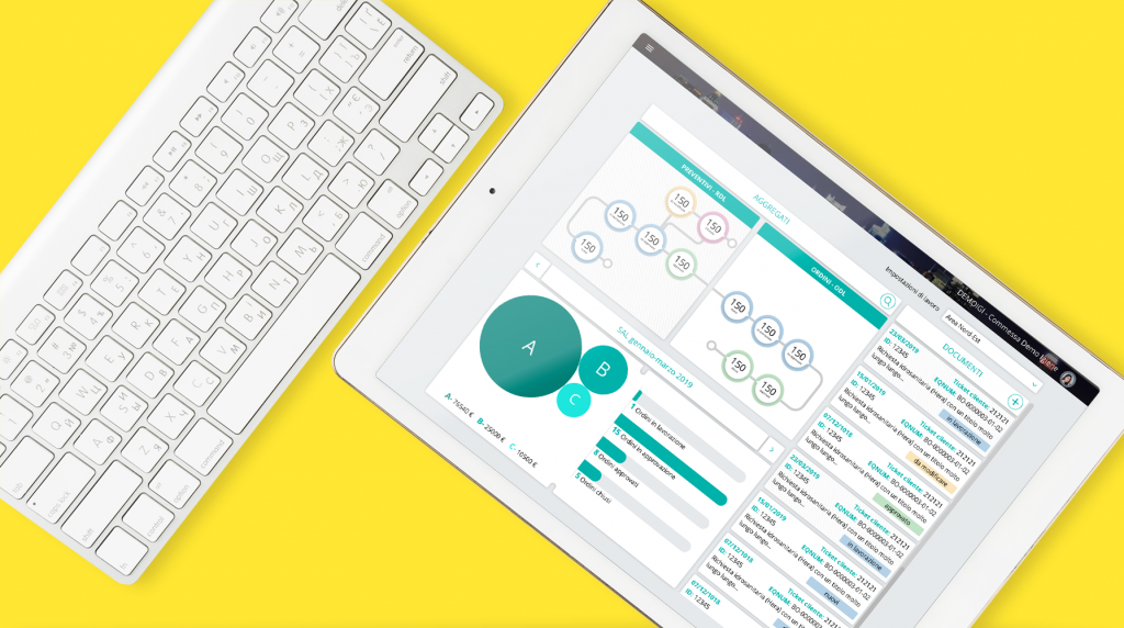
During the past 4 years, the client asked us to redesign his intranet. The client is an international industry of maintenance and cleaning services for public buildings. He has more than 17k employees and 90 offices. Intranet helps him to manage his integrated facilities. Every year we redesign an area of this intranet. The last one is the area for estimates and invoices. The main goal is to simplify the navigation and to brand the visual identity.
The process
Discover
usability test
In thinking aloud test, I asked test participants to use the actual system while continuously thinking out loud — that is, simply verbalizing their thoughts as they move through the user interface. “Simply” ought to be in quotes, because it’s not that simple for most people to keep up a running monologue.
So, sometimes, I have to prompt users to keep them talking. In this way, I heard their misconceptions, which usually turn into actionable redesign recommendations. Even better, I learned why users guess wrong about some parts of the UI and why they find others easy to use.
user journey map
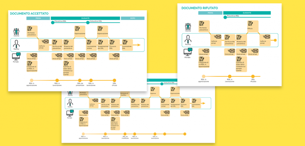
After usability tests, I asked the client to take part in a workshop where we designed the journeys of the actual service, from the point of view of each user.
users
The main user is the operator, an employee of the client. Every operator can see and edit only the projects assigned to him.
macro-functionalities
We collected macro-functionalities list during the brief with the client, because all the services already exist. We focused to understand core functionalities for each service, their overlapped areas and their links.
channels
The intranet should be responsive and should be usable in desktop and landscape tablet sizes.
Design
entity flows
Entity flow helped me to fully understand datas, interaction, scenarios for each screen. Through entity flows I helped the client to simplify some flow, because the operators report the lack of a navigation and consistency through the screen.
wireframes and mockups
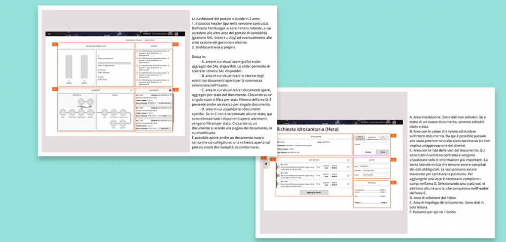
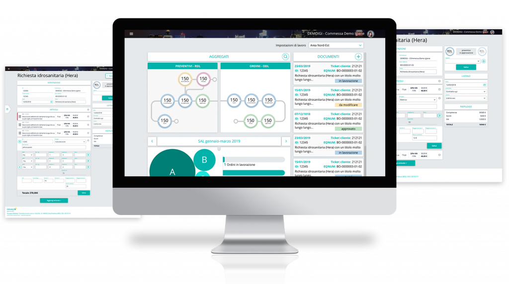
I approached with a hi-def wireframe in order to collect precise feedbacks from client about each screen, its functionalities, its interactions and its copy. Once approved, wireframes became mockup. I decided to proceed with mockups in sketch because the style guide was previously built by this tool.
interactions
Development of this area was external to our agency – Antreem – so it was helpful to make clear all the main interactions. I designed them by After Effects and I gave to developers as an animated gif to preview the animations. I also collect some json files, thanks to Lottie library, in order to simplify developer work.
functional design system
With mockup and interaction I sent to development office also the functional design system. I explained every element, interaction, link for each scenario. FDS was helpful to developers and QA specialist to understand the app.
