Diastasi Guts
Imagine struggling with Diastasis Recti after pregnancy, feeling lost and overwhelmed by confusing information. Diastasis Hub can be your calming guide.
Elena | 2 Apr 2024
The challange
Existing Diastasis Recti resources offered valuable content, but lacked a central hub with easy-to-understand, patient-focused information.
The goal
Create a comprehensive, informative, and supportive website for women recovering from Diastasis Recti.
Unearthing the problem
A competitive analysis revealed a fragmented landscape of websites on Diastasis Recti.
While these resources offered a wealth of information, crucial gaps existed:
- Lack of a centralized hub for easy access.
- Complex medical jargon making information difficult to understand.
- Absence of a supportive community aspect.
A User-Centered Approach
We recognized the need for a user-friendly platform catering to women experiencing Diastasis Recti.
Facing the design obstacles
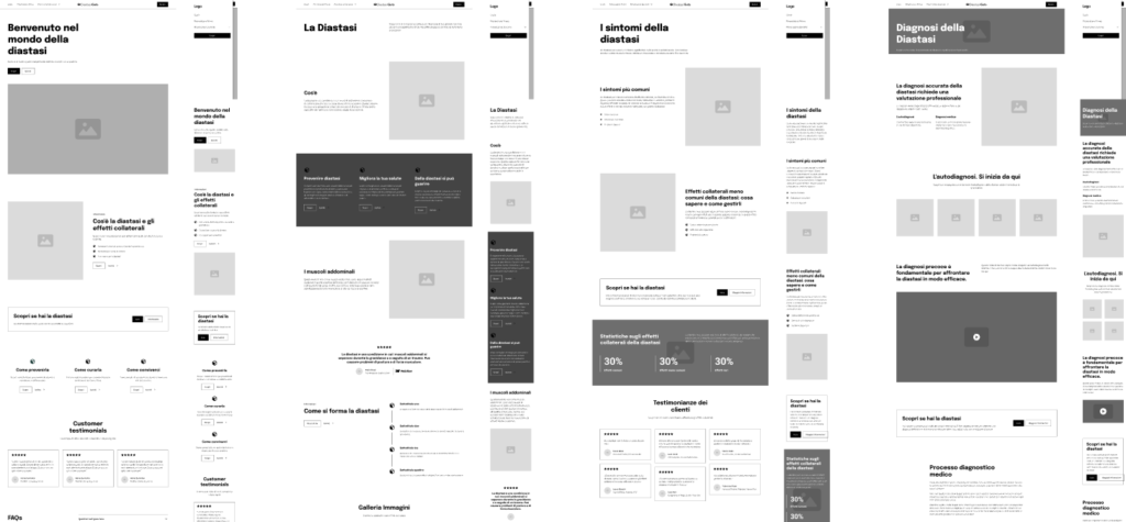
- Initial wireframes, generated using Relume's AI, provided a solid foundation but required further refinement in Figma to ensure a seamless user flow.
- Initial wireframes, generated using Relume's AI, provided a solid foundation but required further refinement in Figma to ensure a seamless user flow.
Crafting a Supportive Experience
- Clear Navigation: Intuitive website structure allows users to easily find the information they need.
- Patient-Centric Content: Easy-to-understand language breaks down complex medical jargon.
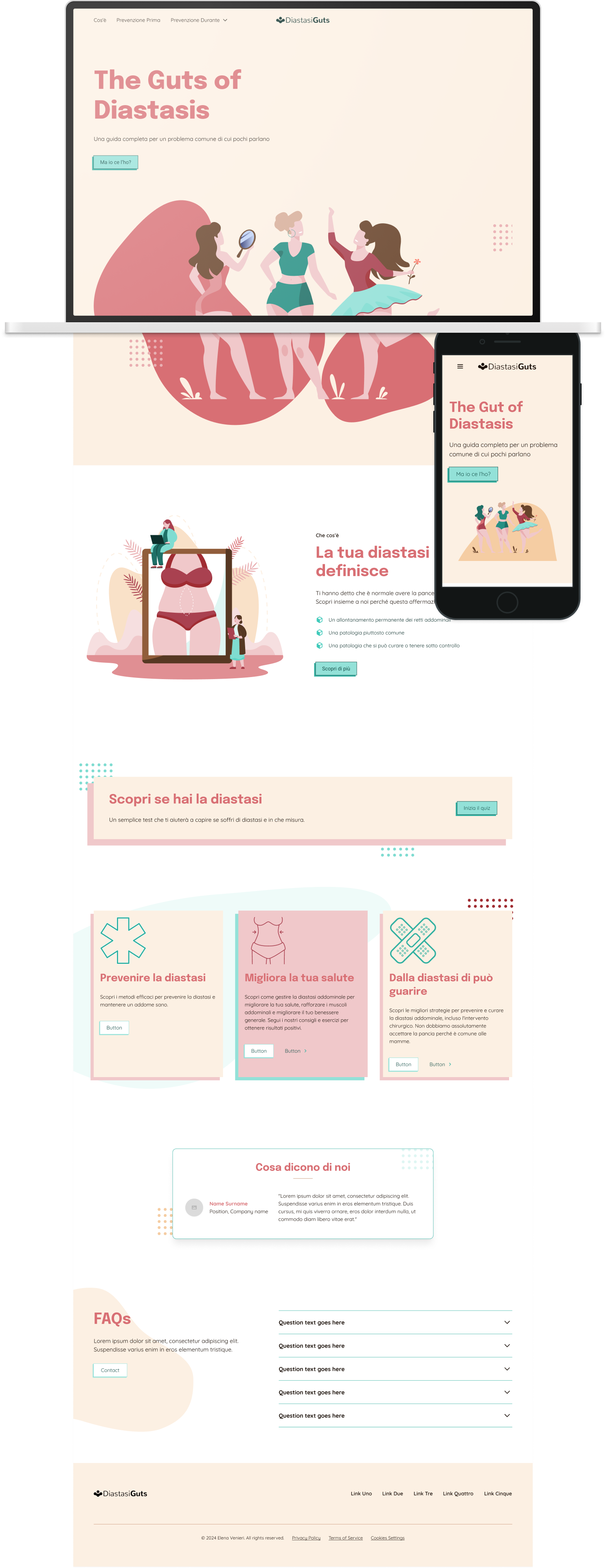
- Visually Appealing Design: A soothing color palette, clear typography, and gentle illustrations create a welcoming and informative environment.
Building a Supportive Community
Future iterations may explore integrating a forum or community features to foster connections and support among women experiencing Diastasis Recti.

The process
Research
The Discover phase commenced with a thorough competitive analysis, revealing a landscape of websites dedicated to diastasis recti. While these resources offered a wealth of information, a critical gap emerged: the lack of a centralized hub that seamlessly integrated comprehensive, easy-to-understand, and patient-centric content. This insight paved the way for the creation of Diastasis Hub, a platform designed to address this unmet need.
Design
Sitemap
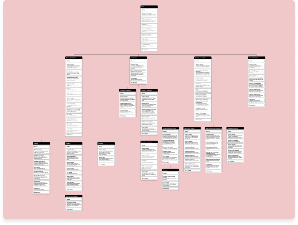
To establish a clear and intuitive website structure, I utilized Relume, an AI-powered tool. Relume‘s capabilities proved invaluable in generating an initial sitemap draft swiftly. This draft served as a solid foundation for further refinement directly within the tool. I seamlessly integrated both manually added sections and AI-generated suggestions, ensuring a well-structured and user-friendly website.
While AI tools like Relume offer remarkable efficiency, it’s crucial to acknowledge that their output may require refinement. A good percentage of the content produced is simply ‘too much’, sometimes to be edited, often to be deleted. But it is a good starting point.

Wireframes
I leveraged Relume’s AI capabilities to swiftly generate initial wireframes, capturing the website’s overall structure and layout. These wireframes served as a foundation for further refinement in Figma, where I meticulously crafted each page, ensuring a seamless user experience.

UI design
The UI design for Diastasis Guts was meticulously crafted to foster a welcoming, informative, and engaging user experience. A soothing color palette, carefully selected typography, and thoughtfully curated illustrations were employed to create a visually appealing and consistent aesthetic that aligns with the website’s overall branding.

My takeways
- Bridge the information gap: By creating a user-centered platform, I ensured access to clear and concise information for women recovering from Diastasis Recti.
- Prioritize user experience: I tackled the challenge of balancing medical accuracy with easy-to-understand language, crafting a user-friendly website.
- Embrace design challenges: I recognized initial design limitations and proactively refined wireframes to achieve a seamless user flow.