Risk simulation tool
Bringing risk simulation into the digital world: readability and data information are the goal
Year
2018
Industry
Fintech
Team
Team Leader, Software architect, developers, UX designer, UI designer. Team by Antreem
Role
UX & UI designer
The challange
Using excel sheets to process huge amounts of data and compile reports that can be read internally and externally is a complex, inefficient and difficult to maintain process.
The goal
The client is a leading provider focused on Risk, Wealth & Performance Management. The task for us was to design the user experience of his core business: financial risk simulations.
The process
Research
Journey
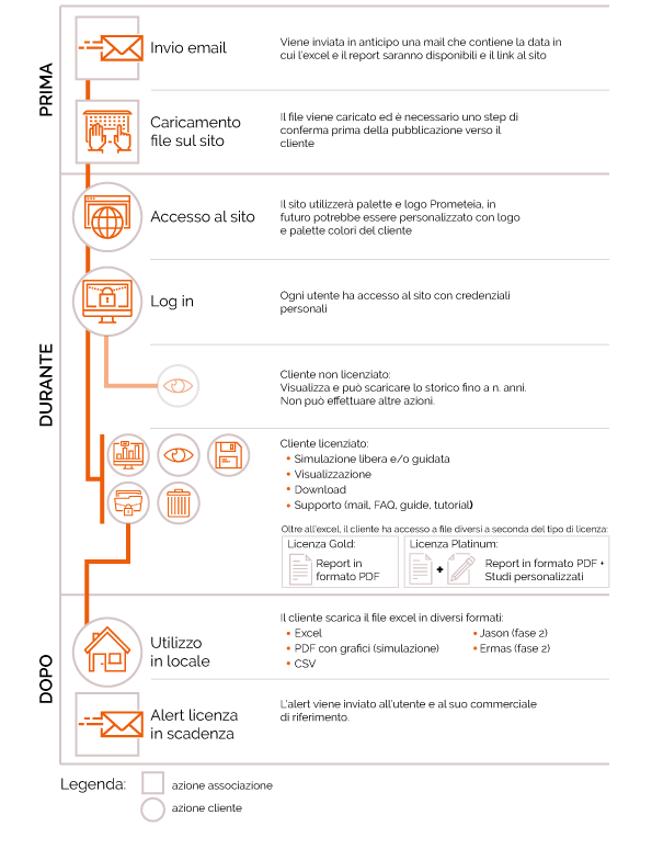
First of all, we had co-working sessions with the clients to understand the actual user experience. The delivery of these sessions was a journey.
Navigation flow
We combined all the collected knowledge of co-working using a Navigation map technique. We designed the navigation map of the as-is service. We know that the rules for designing good navigation are:
- Prioritize consistency
- Design clear interactions
- Avoid deep navigation
- Design for responsive compatibility
We decided to focus on clear interaction e responsive compatibility to help the user read the huge amount of data. We also introduce graphs and tables to simplify user reading.
In this phase, we suggested split the website for each user in order to clarify the core functionalities: a website for the operators, a website for banks and a website for the client himself that upload risk algorithms every year.

Design
Wireframe
After learning about user scenarios and designing navigation flows, we built the base of our UX strategy. Then, we were able to proceed with Low-Fidelity (Lo-Fi) flow development.
Lo-Fi flows are created to understand the correct sequence of the main user scenarios, which have been identified in the previous steps. They help to design and adapt actions that users have to make in order to achieve their goals.
Next, we proceeded to the development of a High-Fidelity (Hi-Fi) wireframe. Our task was to visualize the screen structure and content, considering the logic of the service and all of the previously generated UX insights.
Functional design system
Cause to time constraints, we decided to move up the functional design system before mockup. So developers were able to start to develop.
Concept and mockup
With the UX deliverables in mind, our UI designers composed a mood board for each concept we proposed. When the client chose the concept we applied the visual mood in all the screen through mockup designed in Sketch.

style guide and user manual
Finally, we designed a style guide report and user manual for the client. Style Guide helps developers to keep consistency along with the project while user manual will be given to users to understand the website and its functionalities.
